Respiratory Postcards

|


Sanford Brown College needed to boost enrollments for their Respiratory Therapist programs. Thinking outside of the box, we created this postcard series to "breathe" new life into their program.

Brad's Website

|

Brad Barton needed a new look and feel and a new website for his business. He sells himself as a corporate or educational speaker, to motivate and inspire. His unique selling proposition is that he uses magic and illusion to keep the attention of the audience, and to tell his stories. He's an amazing man, and he needed an amazing, unique, and fun website.

Spanish Campaign

|


Sometimes your target audience speaks Spanish and not a lot of English. When marketing to these people, you have to do things a bit differently. First of all, the copy needs to be in Spanish. :)

This campaign included a postcard followed by a letter to encourage them to begin their training for medical assistants.

Hogan Brochure

|


Hogan Construction believes in great service, strong buildings, and incredible quality. They needed a brochure that showed potential clients how incredible they are and the process they go through to bring them the best quality and the most for their money.

This brochure includes incredible photography, creative design, and lots of unique ways of showing their work. That includes a metal cover with lasered diecut logo on the front, vellum inserts with testimonials and tabs on the back sheet for inserts. It'll surely be an impressive piece, and their clients, or potential clients will be blown away.

Shown here you'll find the cover, inside page that shows through the front cover, and two spreads inside the brochure.

Corporate Brochure

|


Americom needed a new corporate brochure designed that would portray them as the leaders in their industry, especially when it comes to technology, experience and service. This corporate brochure did just that. It's designed with a wrap-around cover with a velcro flap, vellum first page and fold-out tabs for the service pages. Here are 4 brochure spreads.

Brad's Book

|
Brad Barton wrote an amazing self-help book and needed a cover that showcases his new look and feel that I established for him. This book has done really well for him, and he's already on his fourth edition. Great job, Brad!

M2 Technology Brochure

|


M2 Technology needed help with their identity. After giving their current logo an uplift, a new corporate brochure needed to be made. This brochure has a diecut notch at the top that follows their brand, and the inside is full of testimonial stories that showcases their incredible service and love for their customers.
|

A new idea and a new company, Chamber Reach needed a brand new brand that shows their creativity and made people take a second look.

I really wanted to make their business cards something people would remember, and possibly use. I created them so they might be used as a bookmark at the same time. The center circle is die-cut halfway down, so paper could be inserted.

The colors are bright, energetic, and trendy. According to some sites, they are also the up-and-coming colors of the year.

Neighbors Now Identity Package

|

This was a fun package to work on. I first started with the logo. This company spends its time helping other company get connected with the best type of leads, referrals from people you know. The logo shows a conversation, and the unique shapes of the business cards and the unique shapes within the other pieces, show a fun and energetic side to their company.

Declassified Direct Mail

|

Trying to break through the clutter in a mailbox can sometimes be a bit tricky. Quite often a unique envelope and a fun concept will do the trick. This package was another concept for St. Leo University that would definitely be different than anything in the mailbox.

120 Years Direct Mail

|

St. Leo University is known for their history and years of experience. This campaign was meant to show their history through antiquity.

Millennia Web Site

|

Millennia asked for a site that could be used for two different audiences. This one that we developed for them had a login that would take them to the second part of the site. The "featured property" was a must, and it's one of the first things you see. Visual hierarchy was very important with this project.

Earth Day E-mail Campaign

|


Earth Day was a big day at Datamark, and we wanted to celebrate it in a big way. We had fun things planned all day long, and these e-mails were sent periodically throughout the day.

Poll Sound Web Site

|

Poll Sound needed a website in a desperate way. What they had was an obvious templated site with very little content, and absolutely no way to purchase their products. We developed an eCommerce site that would make their competition jealous.

The site is not only functional and beautiful, but it showcases their customer service and their newly established brand.

Wellness Fair Posters and E-mail

|


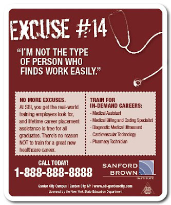
Excuses Print Ad Campaign

|


When it comes to going to school, people always have excuses why they should pursue it. This campaign was meant to remind people of those excuses and how to overcome them.

Recruitment Print Ads

|


Datamark needed a new print ad campaign to recruit new employees. These were created to attract just the right people.

CODI Logo Concept

|

This logo concept was for CODI '06. The mountain theme was to represent the Rocky Mountains in the area. This was a client directive. I personally feel that there are way too many mountains in logos around Utah, but I still thought it turned out to be a nice, clean logo.

EdExperts Identity Package

|

EdExperts needed a new identity, including a face-lift on their logo. These guys are geniuses when it comes to marketing for the education industry, and they needed to show their professionalism, but keep it creative at the same time.

Road Trip CD

|


T Minus 5 is a cool a cappella group that needed an equally cool CD design for their new album "Road Trip."

This turned out really great. The cover is a road map.

The next image is the back cover with the song names as city names.

The inside also shows the song list but more traditionally.

The CD tray itself was the steering wheel of the car they are sitting on. The CD was printed with the same steering wheel, so it could be placed in any position and it'd still look fantastic.

I had a LOT of fun working on this one.