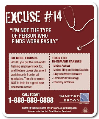
Excuses Print Ad Campaign

|


When it comes to going to school, people always have excuses why they should pursue it. This campaign was meant to remind people of those excuses and how to overcome them.

Recruitment Print Ads

|


Datamark needed a new print ad campaign to recruit new employees. These were created to attract just the right people.

CODI Logo Concept

|

This logo concept was for CODI '06. The mountain theme was to represent the Rocky Mountains in the area. This was a client directive. I personally feel that there are way too many mountains in logos around Utah, but I still thought it turned out to be a nice, clean logo.

EdExperts Identity Package

|

EdExperts needed a new identity, including a face-lift on their logo. These guys are geniuses when it comes to marketing for the education industry, and they needed to show their professionalism, but keep it creative at the same time.

Road Trip CD

|


T Minus 5 is a cool a cappella group that needed an equally cool CD design for their new album "Road Trip."

This turned out really great. The cover is a road map.

The next image is the back cover with the song names as city names.

The inside also shows the song list but more traditionally.

The CD tray itself was the steering wheel of the car they are sitting on. The CD was printed with the same steering wheel, so it could be placed in any position and it'd still look fantastic.

I had a LOT of fun working on this one.
Financial Aid

|


One of my clients, a school group, asked for something new to offer their students as a fulfillment piece, that would entice them to respond. I came up with this financial aid booklet for students to help them understand where to go, who to see, and what to do in order to get the best scholarships, grants, or student loans they need. It was a huge hit, and the campaign doubled the response rates.

This ended up being a template piece we used for multiple school groups after the initial campaign.

DASU Web Site

|

The Dental Assistant School of Utah is a division of EDC. They decided to start teaching the program when their own assistants had such great praise from their patients. I developed this site to capture leads for potential students.

YAD ID Docs

|

Yellow Ad Design was a company that designed nothing but yellow page advertisements. They did a fantastic job at it, but needed help with their identity and branding. I designed the logo and these documents.

EDC Office Posters

|


These posters were designed to decorate the EDC office. They had 10 of them in strategic places and it really made the office look professional, and upscale.

Side note: I art-directed the photoshoot for these projects as well. EDC knew the importance of having great photos. But, the real reason was that nothing existed like this. :)

EDC Web Site

|

With any new compay, and new brand, there needs to be a new Web site. This is what I did for EDC. It was divided into two sections, one for patients and one for dentists.

EDC Thank You Card

|

After each visit, Emergency Dental Care sends out a thank you card to their patients, thanking them for the visit. It's a very personal, and effective way for their patients to connect more with the doctor. These were a big hit.

EDC Mouse Pad

|

A great way to "get the word out" to local dentists is to supply their receptionists and nurses with mouse pads that had all the information they needed. This is a mouse pad I did for them, for this very purpose.

EDC Booth Graphics

|


EDC needed a backdrop and table wrap for a booth display. I created something easy to look at and understand, without a lot of copy or bullet points. Backdrops should be simple and understood at a distance. This is how it turned out.

EDC Brochure

|


EDC needed a brochure that explained their unique selling proposition. It was a brochure that went to dentists, not patients. Their specialty was emergency dental work, and they would get most of their patients as referrals from dentists that didn't have the time or patients to deal with them.

EDC ID Docs

|

One of the first things to create when establishing a new brand is their letterhead. It quite often determines what the rest of their branding pieces will look like. This is what I did for Emergency Dental Care.

Boston University Viewbook

|


This college is one of the nation’s most respected schools and needed promotions of their new computer and technology program to be “right on the money.” We started out with a direct mail package that contained a letter and response device. When the prospective student called or mailed in the response device, we sent them a full-color, twenty-page booklet, highlighting the school and the computer and technology program offered.

These are the cover and one inside spread of the follow-up booklet. Teamed with a copywriter, we designed a brilliant campaign to get prospective students interested in the program and ultimately get them to enroll. Because of it’s success, this campaign became a model for future campaigns done for other proprietary schools.

FT Direct Mail

|

Florida Tech asked for a direct mail piece targeted to high school students. This one I did with an illustrative style and bright colors. I had to keep it 2 color, but I still think it turned out pretty nice. Besides, the piece did rather well and was the control for half a year.

AI Direct Mail

|

The Art Institute of Orange County in California needed a direct mail piece to promote their art programs to a certain target audience. I developed this campaign with "Evolve" as the central part of the message and design. The idea was to get the audience to realize that they needed to evolve themselves from their dead-end jobs or fresh high-school graduates to a growing and popular career.

East-Broadway Poster

|

I designed this poster to announce what they had available for the holidays. It was simple, clean and very appropriate for a non-Christmas feeling holiday poster. The 2 colors helped out a lot too. You don't always need to do 4 color process. :)

Subpoena Direct Mail

|

Bryman College needed a new piece that would get through the clutter in the mailbox. This was meant to test against their control package. It's patterned after an official subpoena in the State of California, and meant to scare people to open the envelope. Once opened they would hopefully giggle at the cool twist where we try to convince them that an education from Bryman College is what they need.